
The problem
Say you have a map with a lot of map markers. The map is slow and cluttered.
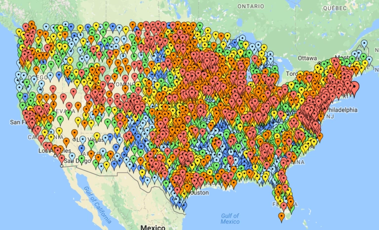
How would you solve this the standard way? Most map providers include a clustering feature that gets you the following result:
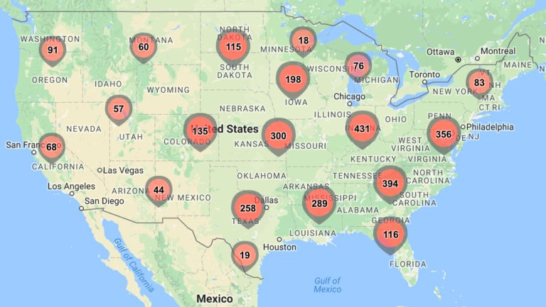
Clustering solved the lag and the overlap that come with a large number of densely placed markers, but it created a massive UX problem.
Clustering hides data.
It forces users to click, zoom and pan more, hoping the cluster they are expanding actually contains what they are looking for. It sacrifices geographical and contextual precision for the sake of performance.
A better way
We have been building @arenarium/maps, a library that avoids the clustering problems by focusing on the core issue — overlapping markers. It does this by computing the optimal state for each marker based on a user provided rank. The state describes when to reveal a marker and where to position it relative to its coordinate as the zoom changes.
The result is that every marker is optimally positioned as the user moves around the map, maximizing clarity and information density instead of trading one for the other.
Let's examine a similar issue as before, but solve it in a better way. Here are rental price markers with no layout logic at all:
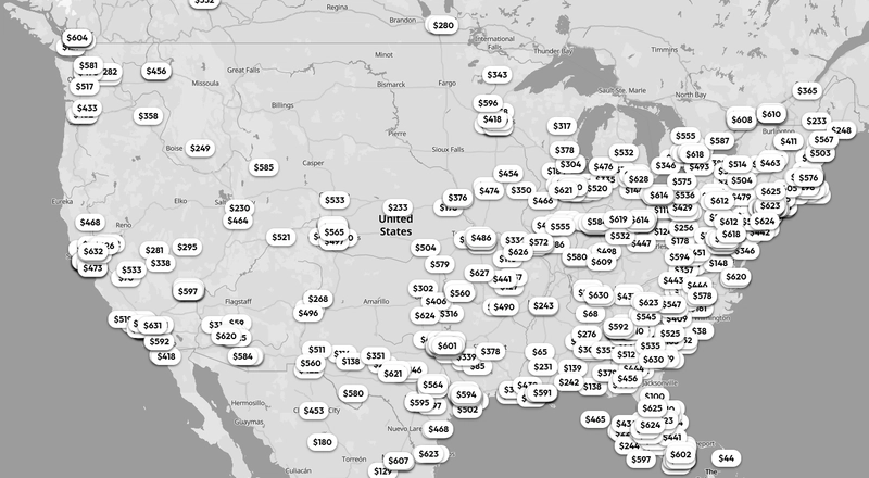
Managing the same markers with @arenarium/maps we get:
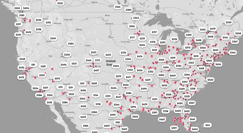
By avoiding clustering, we maintain spatial integrity and increase information density. If a marker represents a specific building or an event, it stays on that coordinate. There is no merging and no snapping. This leads to a more elegant, professional and ultimately more useful map interface.
The same problem, solved without clustering. Try the interactive demo with booking, rental, doctor, social and news style markers.
The structure of a marker
As the user moves around the map, markers transition between three states based on zoom level and rank:
- The pin — the background layer. A round element that conveys the basic information about a marker through a color or an icon. Pins give the map a heat-map feel without cluttering the view.
- The tooltip — the primary layer. Tooltips are revealed by rank whenever no overlap exists. They contain the basic information that should always be readable.
- The popup — the extended layer. Popups are shown when a user clicks a tooltip. They contain additional information that would make a tooltip too large, such as images.
Read the documentation for the full marker configuration, including dimensions, styles and ranking.
Provider compatibility
The library is built to be a plug-and-play solution regardless of your mapping provider. The architecture is split into two core parts:
- The core library (
@arenarium/maps) — the npm package that manages the state logic and coordinates with the optimization compute API. - The integration packages — the npm packages that serve as an abstraction layer for Google Maps, Mapbox and MapLibre.
Check it out
Live demos live on the home page and the full documentation is in the docs. Have any questions or feedback? Contact us.